Petron, A Loyalty Platform that Tracks Points From Gas Transactions
Collaborators
2 UX Design Leads
2 UX Designers
1 Design Strategist
1 Visual Designer
Role
Lead Visual Designer
Duration
5 Weeks
Company
Petron Corporation
MY CONTRIBUTIONS
Research
Performed a design audit and competitive analysis
Prototyping
Designed wireframes that were reviewed by internal Petron users
Hi-Fidelity
Oversaw hi-fidelity mock-up creation and presented them to stakeholders
Design System
Built design system for the entire project from scratch
PROBLEM SPACE
Petron Corporation, the largest oil refining and marketing company in the Philippines, tasked us with redesigning their rewards application and microsite. The site and application serve as a platform to help users track and redeem points for gas and other rewards. The biggest problem with their current platform was the slow registration process, no visibility on points tracking, and unclear instructions on redeeming rewards. The goal was to improve those features.
SETTING THE SCOPE
I worked on 5 core features for both the mobile application and website
But for this specific case study, I’ll be focusing on the following portions: dashboard, rewards page, and design system
Splash and onboarding
✅ Dashboard
Topping up points
✅ Rewards Page
Transferring Points
DESIGN APPROACH
A streamlined rewards experience where users can easily view their points and redeem rewards.
Redeem rewards based on points collected
Surfaces redeemable rewards and promos based on the number of accumulated points from gas transactions.
View points and available benefits at a glance
Types of cards are visually distinct and display necessary information including the number of points, last transaction, card name and number
Easily keep track of points from gas transactions
Transaction history includes all points earned from gas transactions to encourage users to keep gassing up with Petron.
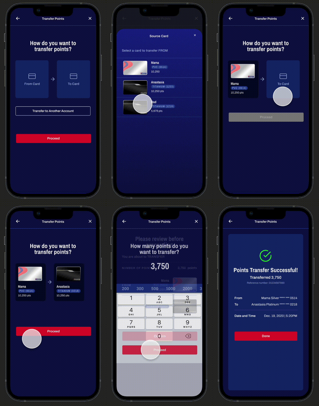
Transfer and manage points between cards
Since each household carries more than one card, this features allows user to transfer points from one card to another. Additionally, we allowed users to name their cards, which helped reduce confusion with card numbers.
THE CHALLENGE
Design an intuitive rewards experience for Petron’s loyal card holders
Broad Business Requirements:
-
Petron’s previous development team had designed their rewards platform without giving much thought to the gas companies’ brand. As a result, stakeholders requested that we redesign the application according to their visual brand and messaging
-
On top of having to deliver the improved minimum viable product to outsourced developers in 5 weeks, we were also tasked with implementing new features. Stakeholders saw the rebrand as an opportunity to add new features to their product.
-
Ensure the experience is intuitive and user-friendly
RESEARCH
A design audit revealed the following problems in the current application:
-
Critical home or dashboard screens were underutilized
There were 6 values or numbers on the dashboard, all with unclear labels. Leading to confusion on the amount of points they actually had.
Petron has 3 card tiers with no visual distinction between them.
Their current dashboard had no visibility on their recent gas transactions. As a result, users were unaware if their points were credited to the system or not.
-
Navigation had no systematic text and visual hierarchy making it hard to discover rewards and benefits.
Unclear difference between types of rewards and benefits.
Instructions of how to redeem rewards and benefits were unavailable
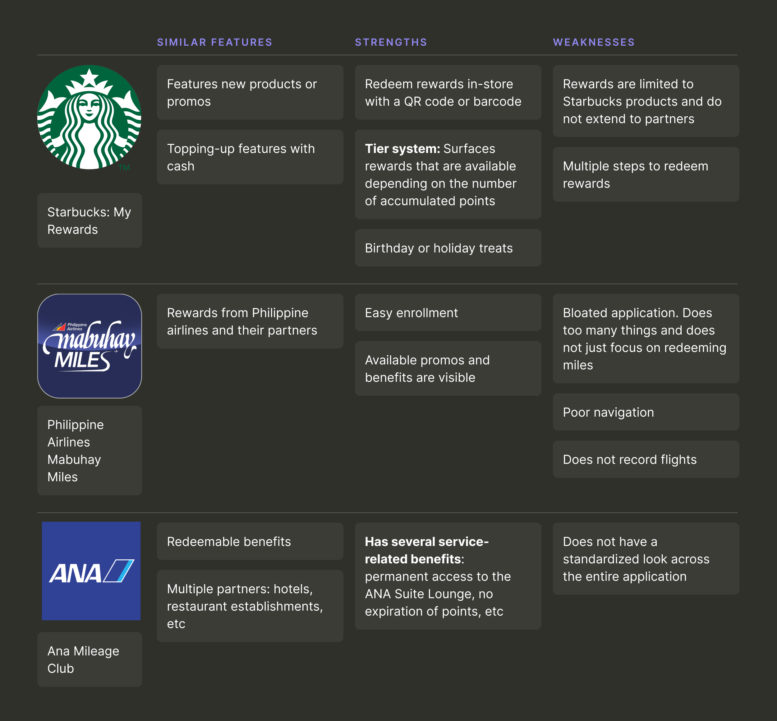
Completed a brief competitive analysis on other rewards applications in the market
PROTOTYPING & FINAL DESIGN
Improved troubling features based on user needs
User need #1: Visibility of points and transactions per card
Old Screens
Wireframes
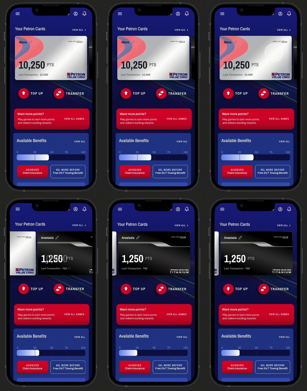
Improved distinction between cards and their tiers
Previously, all the card tiers looked the same so I created 3 distinct looks for each card tier. I referenced the physical card to improve the cognitive link with the digital card. Secondly, users can rename their cards instead of seeing the card number.
More discoverable benefits and rewards
Made rewards and benefits more discoverable by improving the information hierarchy. At the very top, I included accumulated points, followed by redeemable benefits, rewards and most recent transactions.
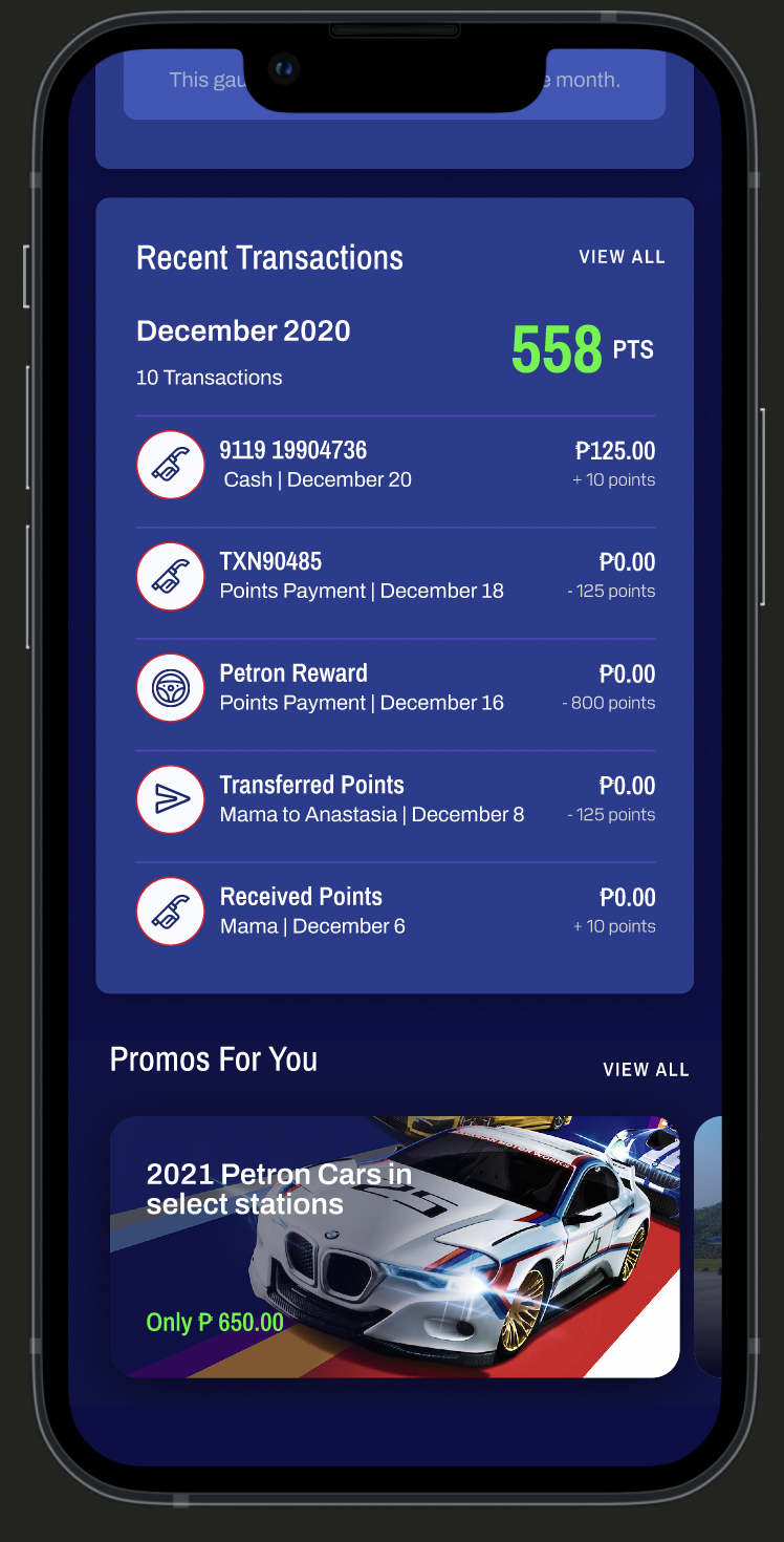
Keep track of recent transactions
Developed a recent transactions feature. While creating this feature, I identified all the possible types of transactions and used that data to guide the design of each entry.
User need #2: Make rewards more accessible and understandable
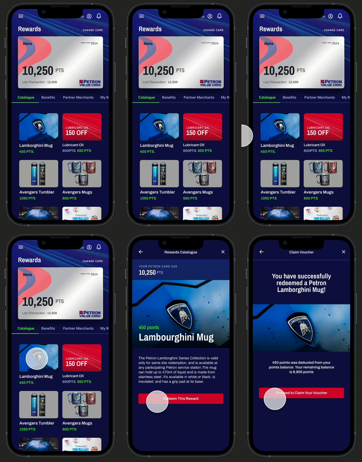
The rewards page was initially confusing, as it combined rewards based on points and benefits linked to gas liters. I improved its structure and separated the catalogue, benefits, and partner merchant sections.
Old Screens
New information architecture for rewards page
Conveniently redeem engine oil and merchandize
In the catalogue, users can use their points to redeem engine oil, gasul, and merchandize. Used progressive disclosure to relay redeeming instructions.
Be informed of available benefits from accumulated gas liters
Made it clear that benefits can only be redeemed by earning a certain amount of gas liters. Used a meter to visually show how many liters they have obtained and how many more they need.
Easily find partner merchants by category
Petron has many types of partnerships including restaurants, travel, health, etc. Using the dropdown, users can sift through the available partner rewards by category.
VISUAL DESIGN
Created a robust design system that matched their brand
In order to make the application design cohesive with the brand, I took into consideration existing imagery, typography, and colors but optimized them for digital platforms. I then held a workshop with stakeholders from Petron and presented my design explorations to them. Together, we were able to decide on a design direction that matched their brand. I then built a scalable design system that standardized visual elements across different devices.
Chosen Visual Design Direction
Other Visual Design Exploration
Created Color Guidelines for a Cohesive Look
The core blue family serves as the primary color across the entire application while the additional colors are used as accents. Apart from being cohesive with their current branding, the colours also pass AA WCAG 2.0 guidelines for contrast accessibility. Achieving the AA WCAG 2.0 standard ensures readability to avoid eye strain for users.
Readable Text Hierarchies Per Device
In order for the microsite and application to be readable on respective devices, I set different font scales to accommodate each device's aspect ratio. Additionally, Clients were on a tight budget so free font pairings from Google Fonts were chosen
Standardized Buttons Across the Application
I Illustrated Unique and Custom Icons for Cohesive Branding
Custom icons designed like speed lines were used for on-boarding pages, success pages, and etc. Line art icons were used for utilitarian purposes.
IMPACT
What were the Results?
Delighted Customers!
With the newly launched platform, users were able to track points, instantly view their transactions and rewards.Launched On Time
Due to a tight deadline, we faced the challenge of revamping an entire application within a mere four-week timeframe. However, through effective division of labor and efficient collaboration, we successfully delivered the project to the developers on schedule.Retained as Preferred Partners
Impressed by the quality of our work, the clients chose to retain our services as trusted partners for phase 2 of the application's development.
Reviews from the Google Play Store
REFLECTIONS
What Would I do Differently?
Negotiate for More Usability Testing
5 weeks didn't feel like enough time to fully flesh out the design and I would have appreciated more time to experiment, iterate, and test the user flow. Moving forward, I think it would have been beneficial for my team to educate clients about the importance of user testing even if it comes at a much higher cost to them. Especially since releasing a product that is not properly tested could cause them more harm than good.Hand-Off Notes Are Not Enough
It is so important to work with developers to implement the design according to how it is envisioned. Unfortunately, I could not oversee the development of the product once it was handed over due to business constraints. Even if notes were left during hand-off, there were still discrepancies in the design.Improved Accessibility
Begin the design process with accessibility in mind and not just as an after thought. As a designer, I would have liked to have more time to think of ways we could have incorporated accessibility apart from just color and text


